- Posts: 11526
- Thank you received: 3050

~~~~~~~~~~~~ IMPORTANT INFORMATION -- Please read! ~~~~~~~~~~~~
1. The "search..." box above searches the Docs & Forum Posts. The "Search" tab above just searches the Forum Posts. 
Please use these to search for your issue *before* creating a new message topic, as your issue may have been previously solved.
2. Please put your Club # and Club Web Address in your Forum Signature (best) OR in each post to get faster support from us.
Click here to edit your signature at the bottom of the Profile Information tab.
3. Our user and admin docs are available at:
support.toastmastersclubs.org/doc
"There's a doc for that!" ")
4. There is an "Opt In" Feature for newly added members. The Opt In document explains the [strike]strikethrough[/strike] member information.
Click Here to View the Post
5. When posting a
New Topic
, please include all relevant details and be specific. When did your issue 1st occur?
What operating system, browser, & browser version are you using?
Did you refresh your browser cache? Are your cookies enabled? Lastly, a
screen shot
is often helpful.
6. Please abide by the
Terms of Use
. We are volunteers contributing our spare time. We are happy to assist you, so long as you are respectful and courteous.
7. We are always looking for new FreeToastHost Ambassadors to join our team and support fellow Toastmasters in their use of the FreeToastHost website system. If you are familiar with the system and have some interest, send a
Send Us a Private Message.
How to make your website content "responsive" / mobile friendly
- SteveTheTechie
- Topic Author
- Offline
- Administrator
-

Less
More
7 years 3 weeks ago - 6 years 11 months ago #70249
by SteveTheTechie
As we will soon be rolling out a website template revision that will be more mobile friendly, I wanted to take a moment and provide some pointers on how to make your website *content* more mobile friendly.
I can certainly make the template have a responsive / mobile friendly layout, but if your content is not also "responsive" / mobile friendly, it is kind of all for nothing. Keep in mind that your website is essentially your content spliced into our website template... Therefore, your website depends on *both* being mobile friendly. At some point, I may come up with some "content massaging" tools to help with this, but that will be a bit more into the future. For now, I have created this topic thread with some pointers and I may add to this in the tuture.
There are four main types of content that need attention to make your content really responsive and mobile friendly.
1. Pictures
2. Iframes and embedded objects
3. Text font-sizes
4. Tables
I will cover each of these below and provide some pointers on what to do with them.
Last edit: 6 years 11 months ago by SteveTheTechie.
The topic has been locked.
- SteveTheTechie
- Topic Author
- Offline
- Administrator
-
Less
More
- Posts: 11526
- Thank you received: 3050
7 years 3 weeks ago - 4 years 4 months ago #70250
by SteveTheTechie
Replied by SteveTheTechie on topic How to make your website content "responsive" / mobile friendly
1. Pictures
The key consideration with pictures is that their width should automatically adjust to fit the screen width without becoming the picture becoming distorted. In technical terms, what this means is that the height to width ratio of the image (the "aspect ratio") should always stay the same. But how to do this?
If you use the rich text editor ("CKEditor") embedded in FreeToastHost, you will likely discover sooner or later that it tends to put picture sizes in terms of pixels wide by pixels high. We call these absolute dimensions because they never change regardless of the available screen dimensions. This means that if a picture is too big for the screen width, it may be cut off or you may need to scroll or zoom to see it all.
A key aspect of a "responsive layout" is that there should be no zooming or *horizontal* scrolling need to see the content, regardless of the screen width. Notice that some vertical scrolling is considered OK, but you should try to not make users excessively scroll to see content. (This is also why we tend to discourage really long home pages.)
The way to make pictures size adjust to fit the screen width is to express the width as a percentage of the available width and do not specify a height at all (do not even use zero as the height). When you do this, the browser will figure out the best height to maintain the same height to width ratio.
Here is an example (below)... Notice how I have expressed the width as a percentage.
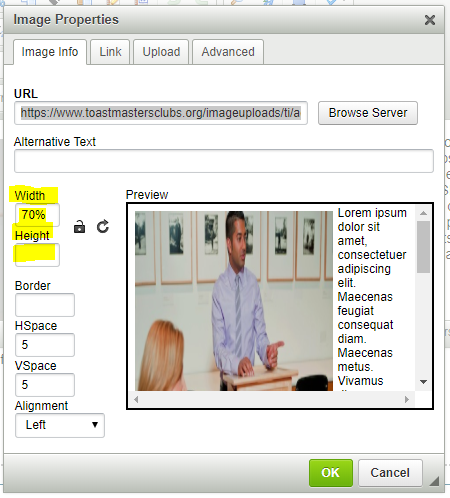
What this does is to force the browser to scale the image to fit the available screen width.
If you are unsure how to calculate the percentage, use the current pixel width dimension of your images, divide them by 670 and multiply by 100%. That should get you close to the right percentage width. BTW, do not pay any attention to the sample in the preview window of the dialog... it is frequently misleading.
The key consideration with pictures is that their width should automatically adjust to fit the screen width without becoming the picture becoming distorted. In technical terms, what this means is that the height to width ratio of the image (the "aspect ratio") should always stay the same. But how to do this?
If you use the rich text editor ("CKEditor") embedded in FreeToastHost, you will likely discover sooner or later that it tends to put picture sizes in terms of pixels wide by pixels high. We call these absolute dimensions because they never change regardless of the available screen dimensions. This means that if a picture is too big for the screen width, it may be cut off or you may need to scroll or zoom to see it all.
A key aspect of a "responsive layout" is that there should be no zooming or *horizontal* scrolling need to see the content, regardless of the screen width. Notice that some vertical scrolling is considered OK, but you should try to not make users excessively scroll to see content. (This is also why we tend to discourage really long home pages.)
The way to make pictures size adjust to fit the screen width is to express the width as a percentage of the available width and do not specify a height at all (do not even use zero as the height). When you do this, the browser will figure out the best height to maintain the same height to width ratio.
Here is an example (below)... Notice how I have expressed the width as a percentage.
What this does is to force the browser to scale the image to fit the available screen width.
If you are unsure how to calculate the percentage, use the current pixel width dimension of your images, divide them by 670 and multiply by 100%. That should get you close to the right percentage width. BTW, do not pay any attention to the sample in the preview window of the dialog... it is frequently misleading.
Last edit: 4 years 4 months ago by SteveTheTechie.
The topic has been locked.
- SteveTheTechie
- Topic Author
- Offline
- Administrator
-
Less
More
- Posts: 11526
- Thank you received: 3050
7 years 3 weeks ago - 6 years 11 months ago #70251
by SteveTheTechie
Replied by SteveTheTechie on topic How to make your website content "responsive" / mobile friendly
2. Iframes and Embedded Objects
For iframes such as YouTube videos and similar types of content, you will need to insert a "wrapper element" in your content as follows. You will need to do this in Source View--I realize some of you may not be comfortable with that. (Feel free to ask us to coach you through it.)
If your video shows up in Source View similar to the following (hypothetical):
<iframe id="your-video"></iframe>
Then, you can "wrap it" as follows to make its size adjust for smaller screen widths:
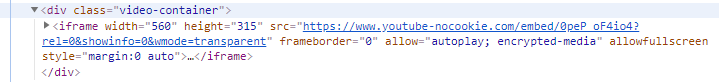
<div class="video-container">
<iframe id="your-video"></iframe>
</div>
This wrapping approach should also work for Flash and embedded objects. There is some responsive styling (CSS) "magic" applied to the elements with the "video-container" class name.
This is the approach that is used for the promotional YouTube video in the home page accordion panels. If you view it on a smaller screen, you will note that its width shrinks. The following is the actual HTML for that video (note how I also use this approach):
For iframes such as YouTube videos and similar types of content, you will need to insert a "wrapper element" in your content as follows. You will need to do this in Source View--I realize some of you may not be comfortable with that. (Feel free to ask us to coach you through it.)
If your video shows up in Source View similar to the following (hypothetical):
<iframe id="your-video"></iframe>
Then, you can "wrap it" as follows to make its size adjust for smaller screen widths:
<div class="video-container">
<iframe id="your-video"></iframe>
</div>
This wrapping approach should also work for Flash and embedded objects. There is some responsive styling (CSS) "magic" applied to the elements with the "video-container" class name.
This is the approach that is used for the promotional YouTube video in the home page accordion panels. If you view it on a smaller screen, you will note that its width shrinks. The following is the actual HTML for that video (note how I also use this approach):
Last edit: 6 years 11 months ago by SteveTheTechie.
The topic has been locked.
- SteveTheTechie
- Topic Author
- Offline
- Administrator
-
Less
More
- Posts: 11526
- Thank you received: 3050
7 years 3 weeks ago - 6 years 11 months ago #70252
by SteveTheTechie
Replied by SteveTheTechie on topic How to make your website content "responsive" / mobile friendly
3. Text / Font Sizes
Generally speaking, use percentages (or "em"s) for font sizes. The rich text editor typically puts all fonts in fixed pixel sizes... not helpful for responsive layout.
Here is a decent conversion chart for font sizes: websemantics.uk/articles/font-size-conversion/
Generally speaking, use percentages (or "em"s) for font sizes. The rich text editor typically puts all fonts in fixed pixel sizes... not helpful for responsive layout.
Here is a decent conversion chart for font sizes: websemantics.uk/articles/font-size-conversion/
Last edit: 6 years 11 months ago by SteveTheTechie.
The topic has been locked.
- SteveTheTechie
- Topic Author
- Offline
- Administrator
-
Less
More
- Posts: 11526
- Thank you received: 3050
6 years 11 months ago - 6 years 11 months ago #71171
by SteveTheTechie
Replied by SteveTheTechie on topic How to make your website content "responsive" / mobile friendly
4. Tables
Tables can be a challenge in responsive layouts. However, again the way to handle them is by using percentages for widths instead of pixel widths. If the screen width is smaller, the percentages will make the table widths (and column widths) automatically adjust to the smaller available widths.
The problem you may run into is that even with using percentage widths, your table content may be unreadable on smaller screens like phones. You may need to adjust your font sizes.
Here is some decent background information on why tables are a bit of a challenge and some ideas to handle them:
css-tricks.com/responsive-data-tables/
allthingssmitty.com/2016/10/03/responsive-table-layout/
templates.mailchimp.com/development/resp...sive-column-layouts/
Last edit: 6 years 11 months ago by SteveTheTechie.
The following user(s) said Thank You: yiayia
The topic has been locked.
6 years 11 months ago #71187
by marc33
Replied by marc33 on topic 3. How to make your website content "responsive" / FONT SIZE
CKEditor allows the choice of specific size fonts. Where would you select a %? I used your formula for our home page photo and that worked great. Steve, do you sleep?
Impressed in Santa Clarita
Impressed in Santa Clarita
The topic has been locked.
Time to create page: 0.111 seconds
Copyright © 2025 FreeToastHost 3 Support. All Rights Reserved.