Hi Brian, thanks for the reply.
I can confirm on mobile, the calendar is now scrollable and 4 full days are visible at once. Also I appreciate the month buttons including month, week, and list being on separate line from Month and Year.
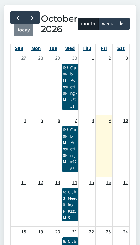
I still have some issues of some text being squished. I have included a photo where the text wrap around can be inconsistent depending on the character length of the text and title event.
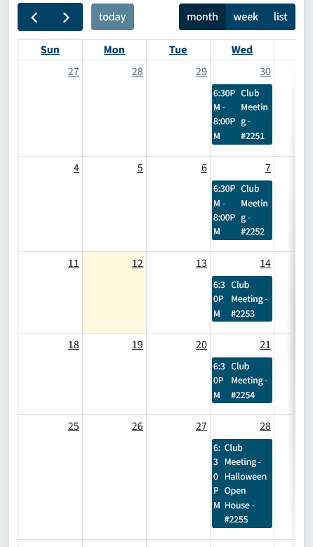
Examples in the photo
- on the 30th and 7th it show '6:30P' on one line with 'M' on the second. The 'g' for Meeting is show on a different line for these dates.
- on the 14th where end time was not declared but the title stayed the same, the time is shown as '6:3', '0P', and 'M' on 3 lines.
- on the 28th we have a longer event name, so we get a taller day block. In this block the time is split onto 5 lines with 1-2 characters per line.
Another concern that i didn't test is if a different club's event is on Thur-Sat, would the calendar scroll position automatically adjust for this? If it always show Sun-Wed by default, a user's initial reaction would be there are no meetings if they don't know they need to scroll to see the Thur-Sat meetings.
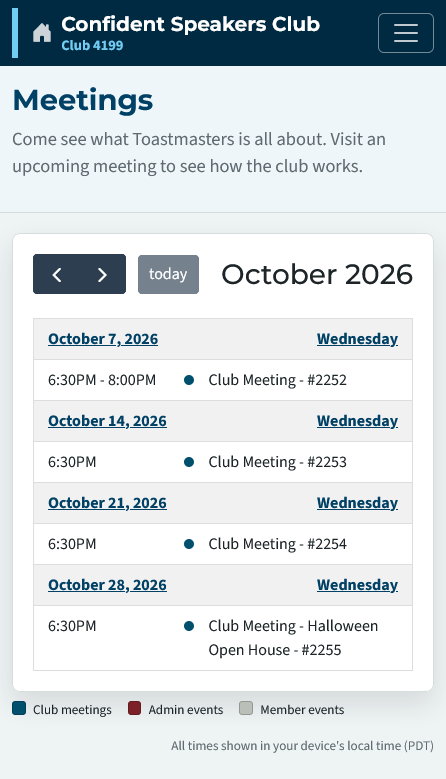
With the fixes you have applied, an easy fix would be defaulting to list view on load when a mobile view is detected. The list view seems to be the best view for mobile where users can easily digest the events.