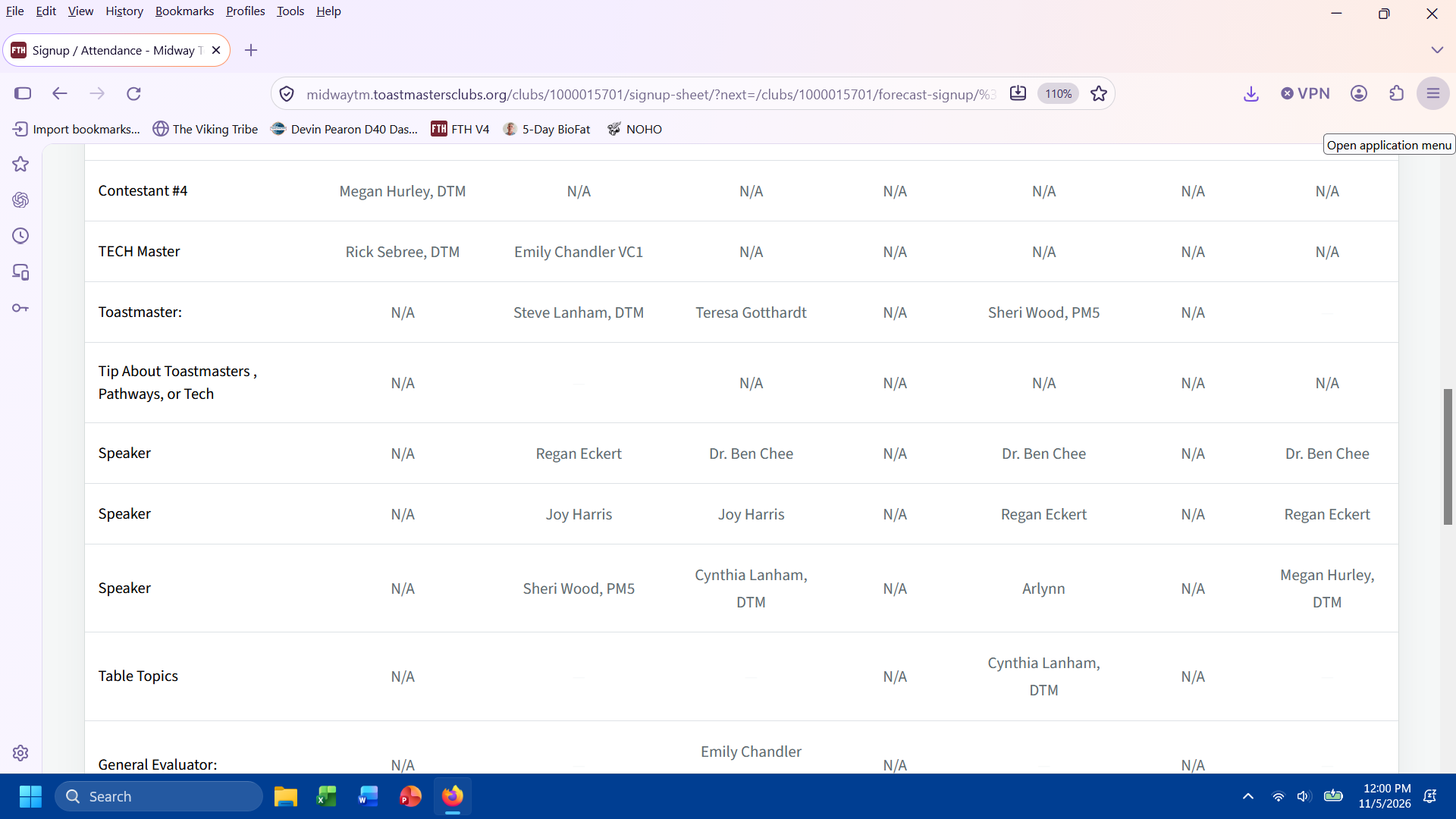
If there is any way to improve the contrast on the website, our members would greatly appreciate it. Tiny, light gray font on a white background is difficult to read.
Arlynn
club #1990654, Midway Toastmasters
Support and Development Site
3 replies · 70 views
If there is any way to improve the contrast on the website, our members would greatly appreciate it. Tiny, light gray font on a white background is difficult to read.
Arlynn
club #1990654, Midway Toastmasters
Last edited 5 Nov 2026, 12:05 p.m. by Arlynn
The text on the signup is small so more will fit on the page, the members can use the CTRL + or cmd + to make it larger.
Every browser has that capability.
👍 Thanked by Arlynn
Thank you. I understand. If we could have more contrast - black vs light gray on white background that would be helpful. Thank you for all that you do! We love FTH V4
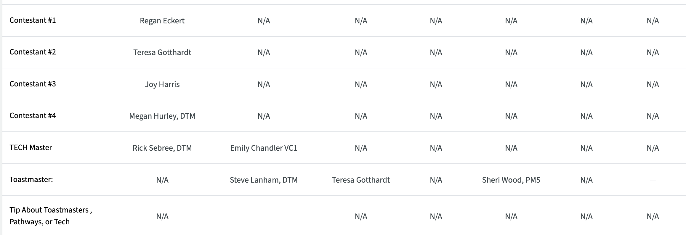
The text on the sign up sheet is now twice as dark.
Log in to reply.