Welcome, Guest
Username: Password: Remember me
1. The "search..." box above searches the Docs & Forum Posts. The "Search" tab above just searches the Forum Posts. :side:
Please use these to search for your issue *before* creating a new message topic, as your issue may have been previously solved.
2. Please put your Club # and Club Web Address in your Forum Signature (best) OR in each post to get faster support from us.
Click here to edit your signature at the bottom of the Profile Information tab.
3. Our user and admin docs are available at: support.toastmastersclubs.org/doc "There's a doc for that!" ;)
4. There is an "Opt In" Feature for newly added members. The Opt In document explains the strikethrough member information. Click Here to View the Post
5. When posting a New Topic , please include all relevant details and be specific. When did your issue 1st occur? What operating system, browser, & browser version are you using? Did you refresh your browser cache? Are your cookies enabled? Lastly, a screen shot is often helpful.
6. Please abide by the Terms of Use . We are volunteers contributing our spare time. We are happy to assist you, so long as you are respectful and courteous.
7. We are always looking for new FreeToastHost Ambassadors to join our team and support fellow Toastmasters in their use of the FreeToastHost website system. If you are familiar with the system and have some interest, send a Send Us a Private Message.
  • Page:
  • 1

TOPIC:

How to make your website content "responsive" / mobile friendly 6 years 6 months ago #70249

  • SteveTheTechie
  • SteveTheTechie's Avatar Topic Author
  • Offline
  • FreeToastHost Developer
  • FreeToastHost Developer
  • Posts: 13529
  • Thank you received: 3831
As we will soon be rolling out a website template revision that will be more mobile friendly, I wanted to take a moment and provide some pointers on how to make your website *content* more mobile friendly.

I can certainly make the template have a responsive / mobile friendly layout, but if your content is not also "responsive" / mobile friendly, it is kind of all for nothing. Keep in mind that your website is essentially your content spliced into our website template... Therefore, your website depends on *both* being mobile friendly. At some point, I may come up with some "content massaging" tools to help with this, but that will be a bit more into the future. For now, I have created this topic thread with some pointers and I may add to this in the tuture.

There are four main types of content that need attention to make your content really responsive and mobile friendly.

1. Pictures
2. Iframes and embedded objects
3. Text font-sizes
4. Tables

I will cover each of these below and provide some pointers on what to do with them.
Regards,

Steve James, DTM
FreeToastHost System Developer
Officer Emeritus, Mindful Communicators (Club 1966, District 52) A President's Distinguished Club for each of the last 10 years.

>>> Please put your club number in your forum profile. CLICK here to edit your profile.
The following user(s) said Thank You: itsmediane, cbb, Maridely, kzmackay
Last edit: by SteveTheTechie.
The topic has been locked.

How to make your website content "responsive" / mobile friendly 6 years 6 months ago #70250

  • SteveTheTechie
  • SteveTheTechie's Avatar Topic Author
  • Offline
  • FreeToastHost Developer
  • FreeToastHost Developer
  • Posts: 13529
  • Thank you received: 3831
1. Pictures

The key consideration with pictures is that their width should automatically adjust to fit the screen width without becoming the picture becoming distorted. In technical terms, what this means is that the height to width ratio of the image (the "aspect ratio") should always stay the same. But how to do this?

If you use the rich text editor ("CKEditor") embedded in FreeToastHost, you will likely discover sooner or later that it tends to put picture sizes in terms of pixels wide by pixels high. We call these absolute dimensions because they never change regardless of the available screen dimensions. This means that if a picture is too big for the screen width, it may be cut off or you may need to scroll or zoom to see it all.

A key aspect of a "responsive layout" is that there should be no zooming or *horizontal* scrolling need to see the content, regardless of the screen width. Notice that some vertical scrolling is considered OK, but you should try to not make users excessively scroll to see content. (This is also why we tend to discourage really long home pages.)

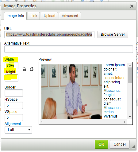
The way to make pictures size adjust to fit the screen width is to express the width as a percentage of the available width and do not specify a height at all (do not even use zero as the height). When you do this, the browser will figure out the best height to maintain the same height to width ratio.

Here is an example (below)... Notice how I have expressed the width as a percentage.


What this does is to force the browser to scale the image to fit the available screen width.

If you are unsure how to calculate the percentage, use the current pixel width dimension of your images, divide them by 670 and multiply by 100%. That should get you close to the right percentage width. BTW, do not pay any attention to the sample in the preview window of the dialog... it is frequently misleading.
Regards,

Steve James, DTM
FreeToastHost System Developer
Officer Emeritus, Mindful Communicators (Club 1966, District 52) A President's Distinguished Club for each of the last 10 years.

>>> Please put your club number in your forum profile. CLICK here to edit your profile.
Attachments:
The following user(s) said Thank You: yiayia, GVaughn, GiovanniLizama, cbb, kerint
Last edit: by SteveTheTechie.
The topic has been locked.

How to make your website content "responsive" / mobile friendly 6 years 6 months ago #70251

  • SteveTheTechie
  • SteveTheTechie's Avatar Topic Author
  • Offline
  • FreeToastHost Developer
  • FreeToastHost Developer
  • Posts: 13529
  • Thank you received: 3831
2. Iframes and Embedded Objects

For iframes such as YouTube videos and similar types of content, you will need to insert a "wrapper element" in your content as follows. You will need to do this in Source View--I realize some of you may not be comfortable with that. (Feel free to ask us to coach you through it.)

If your video shows up in Source View similar to the following (hypothetical):
<iframe id="your-video"></iframe>

Then, you can "wrap it" as follows to make its size adjust for smaller screen widths:
<div class="video-container">
<iframe id="your-video"></iframe>
</div>

This wrapping approach should also work for Flash and embedded objects. There is some responsive styling (CSS) "magic" applied to the elements with the "video-container" class name.

This is the approach that is used for the promotional YouTube video in the home page accordion panels. If you view it on a smaller screen, you will note that its width shrinks. The following is the actual HTML for that video (note how I also use this approach):

Regards,

Steve James, DTM
FreeToastHost System Developer
Officer Emeritus, Mindful Communicators (Club 1966, District 52) A President's Distinguished Club for each of the last 10 years.

>>> Please put your club number in your forum profile. CLICK here to edit your profile.
Attachments:
The following user(s) said Thank You: yiayia, cbb
Last edit: by SteveTheTechie.
The topic has been locked.

How to make your website content "responsive" / mobile friendly 6 years 6 months ago #70252

  • SteveTheTechie
  • SteveTheTechie's Avatar Topic Author
  • Offline
  • FreeToastHost Developer
  • FreeToastHost Developer
  • Posts: 13529
  • Thank you received: 3831
3. Text / Font Sizes

Generally speaking, use percentages (or "em"s) for font sizes. The rich text editor typically puts all fonts in fixed pixel sizes... not helpful for responsive layout.

Here is a decent conversion chart for font sizes: websemantics.uk/articles/font-size-conversion/
Regards,

Steve James, DTM
FreeToastHost System Developer
Officer Emeritus, Mindful Communicators (Club 1966, District 52) A President's Distinguished Club for each of the last 10 years.

>>> Please put your club number in your forum profile. CLICK here to edit your profile.
Last edit: by SteveTheTechie.
The topic has been locked.

How to make your website content "responsive" / mobile friendly 6 years 5 months ago #71171

  • SteveTheTechie
  • SteveTheTechie's Avatar Topic Author
  • Offline
  • FreeToastHost Developer
  • FreeToastHost Developer
  • Posts: 13529
  • Thank you received: 3831
4. Tables

Tables can be a challenge in responsive layouts. However, again the way to handle them is by using percentages for widths instead of pixel widths. If the screen width is smaller, the percentages will make the table widths (and column widths) automatically adjust to the smaller available widths.

The problem you may run into is that even with using percentage widths, your table content may be unreadable on smaller screens like phones. You may need to adjust your font sizes.

Here is some decent background information on why tables are a bit of a challenge and some ideas to handle them:
css-tricks.com/responsive-data-tables/
allthingssmitty.com/2016/10/03/responsive-table-layout/
templates.mailchimp.com/development/resp...sive-column-layouts/
Regards,

Steve James, DTM
FreeToastHost System Developer
Officer Emeritus, Mindful Communicators (Club 1966, District 52) A President's Distinguished Club for each of the last 10 years.

>>> Please put your club number in your forum profile. CLICK here to edit your profile.
The following user(s) said Thank You: yiayia
Last edit: by SteveTheTechie.
The topic has been locked.

3. How to make your website content "responsive" / FONT SIZE 6 years 5 months ago #71187

  • marc33
  • marc33's Avatar
  • Offline
  • FreeToastHost Ambassador
  • FreeToastHost Ambassador
  • Posts: 362
  • Thank you received: 55
CKEditor allows the choice of specific size fonts. Where would you select a %? I used your formula for our home page photo and that worked great. Steve, do you sleep?

Impressed in Santa Clarita
Marc Richards, DTM
Valencia Toastmasters 1670
Toastmasters 4 Writers 748804
Club website trainer, District 52
FTH ambassador
The topic has been locked.

3. How to make your website content "responsive" / FONT SIZE 6 years 5 months ago #71188

  • SteveTheTechie
  • SteveTheTechie's Avatar Topic Author
  • Offline
  • FreeToastHost Developer
  • FreeToastHost Developer
  • Posts: 13529
  • Thank you received: 3831

CKEditor allows the choice of specific size fonts. Where would you select a %?


Well, that is the challenge... CKEditor 4.x was never really designed for responsive layouts--it only gives you fixed pixel selections for fonts. The developers know that and the next major version (version 5.x) is supposed to address that, but it is really a huge departure from version 4.x so it may take me a while to figure out how to make use of it in FTH. There are some plugins for the editor (like ckeditor.com/cke4/addon/imageresponsive) but plugins are sometimes not well supported and sometimes buggy.

The short answer on how to change fonts to percentage is that you will need to do that in Source View. There are a variety of font size conversion charts available online that you can reference that can help... For example: here is one of several I found: websemantics.uk/articles/font-size-conversion/

These sorts of issues are why I probably will implement some sort of new Web Page Tool at some point to help with the responsive content conversion. Most people do not want to have to get into the Source View / underlying HTML.
Regards,

Steve James, DTM
FreeToastHost System Developer
Officer Emeritus, Mindful Communicators (Club 1966, District 52) A President's Distinguished Club for each of the last 10 years.

>>> Please put your club number in your forum profile. CLICK here to edit your profile.
Last edit: by SteveTheTechie.
The topic has been locked.

3. How to make your website content "responsive" / FONT SIZE 6 years 5 months ago #71209

  • marc33
  • marc33's Avatar
  • Offline
  • FreeToastHost Ambassador
  • FreeToastHost Ambassador
  • Posts: 362
  • Thank you received: 55
Since Source view is where you suggested we go to modify videos, I played around with percentages in Source view and came away with a satisfactory result. The average user would look at the code though and be clueless. If V 5 does in fact have font sizes as % like for pictures, a lot more people will be served. What you’re doing is superhuman and we all thank you.
Marc Richards, DTM
Valencia Toastmasters 1670
Toastmasters 4 Writers 748804
Club website trainer, District 52
FTH ambassador
The following user(s) said Thank You: GiovanniLizama
The topic has been locked.

How to make your website content "responsive" / mobile friendly 6 years 5 months ago #71257

  • cbb
  • cbb's Avatar
  • Offline
  • Junior Member
  • Junior Member
  • Posts: 24
  • Thank you received: 0
Hi Steve,

2. Iframes and Embedded Objects

This wrapping approach should also work for Flash and embedded objects. There is some responsive styling (CSS) "magic" applied to the elements with the "video-container" class name.


Thank you for all the handy tips. Our website is now mobile phone-friendly. The only tricky bit is that our image slideshow now needs some vertical scrolling to see the caption. Specifying a longer height doesn't do anything. Is this something that can be addressed by some responsive CSS-styling of the <div> or class name? Otherwise, maybe I should just crop images shorter next time?

Many thanks,
Carmen.
Club #8036
Club #8036
The topic has been locked.

How to make your website content "responsive" / mobile friendly 6 years 5 months ago #71260

  • SteveTheTechie
  • SteveTheTechie's Avatar Topic Author
  • Offline
  • FreeToastHost Developer
  • FreeToastHost Developer
  • Posts: 13529
  • Thank you received: 3831

Hi Steve,

2. Iframes and Embedded Objects

This wrapping approach should also work for Flash and embedded objects. There is some responsive styling (CSS) "magic" applied to the elements with the "video-container" class name.


Thank you for all the handy tips. Our website is now mobile phone-friendly. The only tricky bit is that our image slideshow now needs some vertical scrolling to see the caption. Specifying a longer height doesn't do anything. Is this something that can be addressed by some responsive CSS-styling of the <div> or class name? Otherwise, maybe I should just crop images shorter next time?

Many thanks,
Carmen.
Club #8036


I would probably have to take a look at it... Could point me to specifically what you are referring to? (which page, which element, etc.) Your case could maybe help me figure out what I should do for a web page responsive conversion tool.

All this additional stuff that has to be done on content is why it took me so long to do a responsive version of FTH... I suspected it would be more involved than everyone thought. ;)
Regards,

Steve James, DTM
FreeToastHost System Developer
Officer Emeritus, Mindful Communicators (Club 1966, District 52) A President's Distinguished Club for each of the last 10 years.

>>> Please put your club number in your forum profile. CLICK here to edit your profile.
The topic has been locked.

How to make your website content "responsive" / mobile friendly 6 years 5 months ago #71261

  • cbb
  • cbb's Avatar
  • Offline
  • Junior Member
  • Junior Member
  • Posts: 24
  • Thank you received: 0
Thanks, Steve.

It's right on our homepage with the following slideshow iframe:

<iframe width="500" height="1200" src="citymiddaytoastmasters.toastmastersclubs...path=firstslide.html" >style="border: none; margin: 0; padding: 0;"

I've tested different height values, along with not specifying height at all. I also tried to replace that CSS style with iframe-specific attributes. The iframe size seems to have been frozen since wrapping the code in the <div> container that you've specified. So now the slideshow needs scrolling in both my flipbook and phone.

Anyway, would be good to get rid of scrolling, eventually. Will be consulting Dr Google while you work your magic. Very happy with the new FTH2 template. Thanks for dragging it over to the 21st century! :-)

Carmen
Club #8036
The topic has been locked.

How to make your website content "responsive" / mobile friendly 6 years 5 months ago #71262

  • SteveTheTechie
  • SteveTheTechie's Avatar Topic Author
  • Offline
  • FreeToastHost Developer
  • FreeToastHost Developer
  • Posts: 13529
  • Thank you received: 3831
Ok, I am going to tell you what I think you should do...

Instead of using:

<div class="video-container">
<iframe ... ></iframe>
</div>

Use:

<div class="video-container" style="padding-top:75%;padding-bottom:0">
<iframe ... ></iframe>
</div>

Adjust the padding numbers above as needed to get a good result. The percentage number should be equal to (iframe height / available width * 100%) and the padding-bottom should be any extra fixed height that should always be included. You should be able to use 670 for the "available width". The defaults for these are pre-set for the video container class in my style sheet, but they are set as 56.25% and 30px which works for most YouTube videos, but in your case it looks like your height is a bit larger (as a percentage), so you should override the defaults.

This is a good example of where having a tool may help since I could make the code get the actual iframe dimensions and adjust the wrapper accordingly.
Regards,

Steve James, DTM
FreeToastHost System Developer
Officer Emeritus, Mindful Communicators (Club 1966, District 52) A President's Distinguished Club for each of the last 10 years.

>>> Please put your club number in your forum profile. CLICK here to edit your profile.
The following user(s) said Thank You: cbb
Last edit: by SteveTheTechie.
The topic has been locked.

How to make your website content "responsive" / mobile friendly 6 years 5 months ago #71264

  • cbb
  • cbb's Avatar
  • Offline
  • Junior Member
  • Junior Member
  • Posts: 24
  • Thank you received: 0
Yes! Thank you, SteveTheGenie, for that little styling suggestion for my iframe container. Amazing what magic a short piece of code can do. And I love iframes, too, because they do not mess up your meticulous, hard work on FTH2.

Btw, have you disallowed scripts in the new template? My script to display our meeting date and agenda from easy-Speak seems to have died. I just haven't cleared it out of our homepage yet. I put it there because I kept forgetting to update our meeting date floater message. I've just replaced it with another linked custom page.

Anyway, FTH2 seems more attractive now than e-S. e-S is so feature-packed, but a little control-freakish with the archaic club website part of it. And so many people have a hard time using it, not as intuitive as FTH2. But I don't mind having the best of both worlds.

Thanks again,
Carmen.
Club #8036
The topic has been locked.

How to make your website content "responsive" / mobile friendly 6 years 5 months ago #71276

  • ecodoc
  • ecodoc's Avatar
  • Offline
  • New Member
  • New Member
  • Posts: 8
  • Thank you received: 0
I implemented your recommendations and our website seems to be fully responsive now.
Thanks Steve.
The topic has been locked.

How to make your website content "responsive" / mobile friendly 6 years 5 months ago #71287

  • cbb
  • cbb's Avatar
  • Offline
  • Junior Member
  • Junior Member
  • Posts: 24
  • Thank you received: 0

This is a good example of where having a tool may help since I could make the code get the actual iframe dimensions and adjust the wrapper accordingly.


Sounds good. So this is along your proposed "best guess" conversion of content to make it responsive? Less work for non-coders then because your wrapper settings adapt to our content. I wonder then if it's also worth allowing the browser to choose an appropriate image resolution to serve high-density and low-density screens, accordingly. On the other hand, a web page tool to let us selectively convert different parts of our content to be responsive is not bad, either, because it targets specific problems and gives us a bit more control. With regard to making the text size responsive, can we specify viewport units (percentage of viewport) at all?
Club #8036
The topic has been locked.

How to make your website content "responsive" / mobile friendly 6 years 5 months ago #71365

  • SteveTheTechie
  • SteveTheTechie's Avatar Topic Author
  • Offline
  • FreeToastHost Developer
  • FreeToastHost Developer
  • Posts: 13529
  • Thank you received: 3831
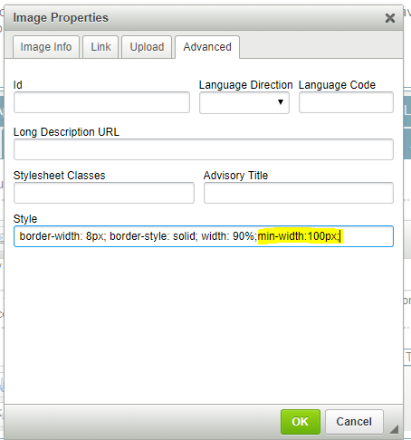
Another tip: If you need to limit the width of your images to minimum width and/or a maximum width, you can do that with the min-width:###px and max-width:###px style settings. These do not have to be in pixels... they could be in pt or em (among the various units)

See here for an example:
Regards,

Steve James, DTM
FreeToastHost System Developer
Officer Emeritus, Mindful Communicators (Club 1966, District 52) A President's Distinguished Club for each of the last 10 years.

>>> Please put your club number in your forum profile. CLICK here to edit your profile.
Attachments:
The following user(s) said Thank You: cbb
The topic has been locked.

How to make your website content "responsive" / mobile friendly 6 years 5 months ago #71457

  • cbb
  • cbb's Avatar
  • Offline
  • Junior Member
  • Junior Member
  • Posts: 24
  • Thank you received: 0
I meant on a small screen. It's prominent enough on a big screen as it is. Never mind, I guess.
Club #8036
The topic has been locked.
  • Page:
  • 1
Moderators: Pamrhtaylor3jliumarc33NotLiabledeedubbleyooNSBPhyllis Kirouac
Time to create page: 0.096 seconds
Powered by Kunena Forum